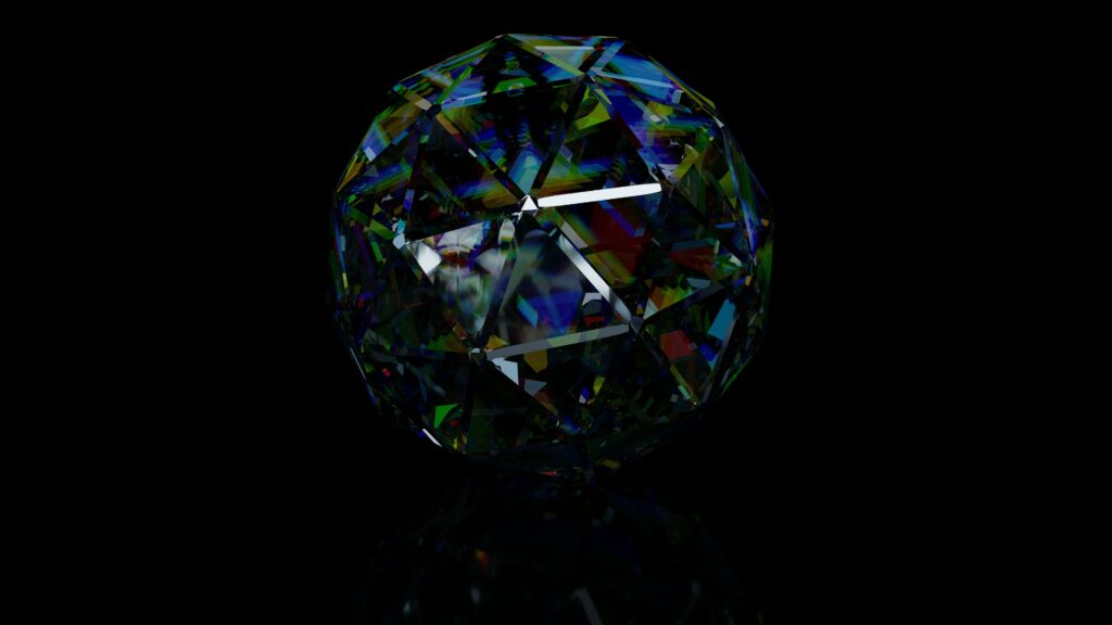
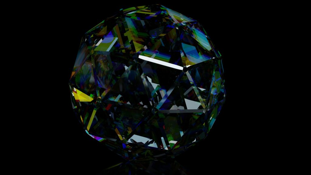
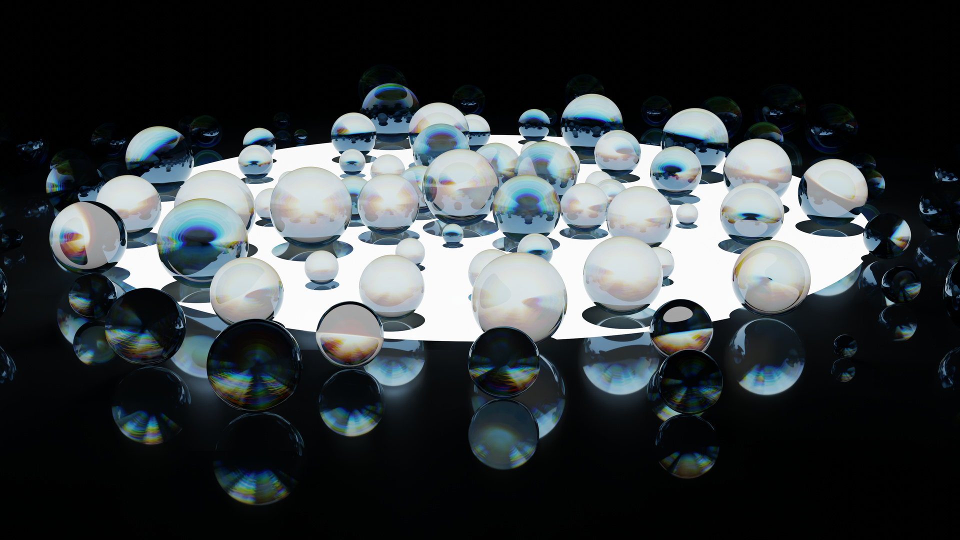
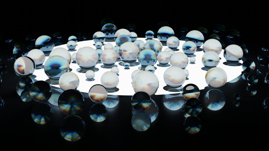
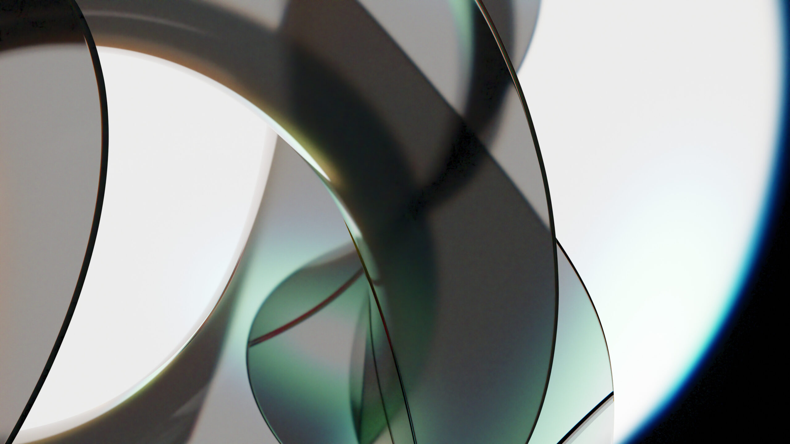
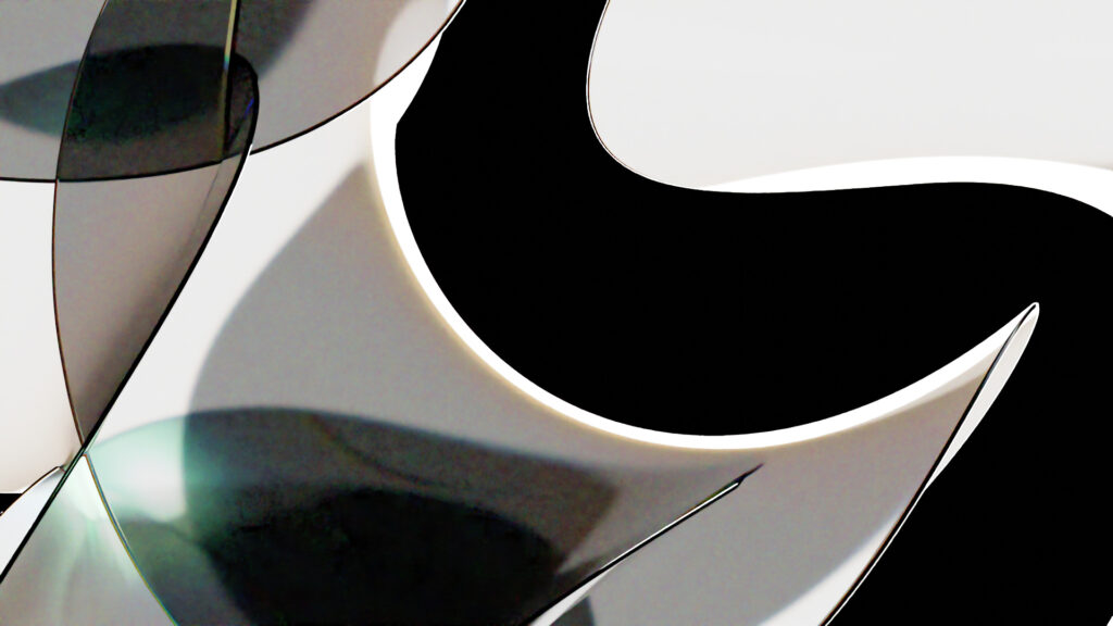
It’s a bit like the last ones, but with a more complex object, the icosphere.
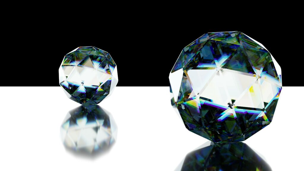

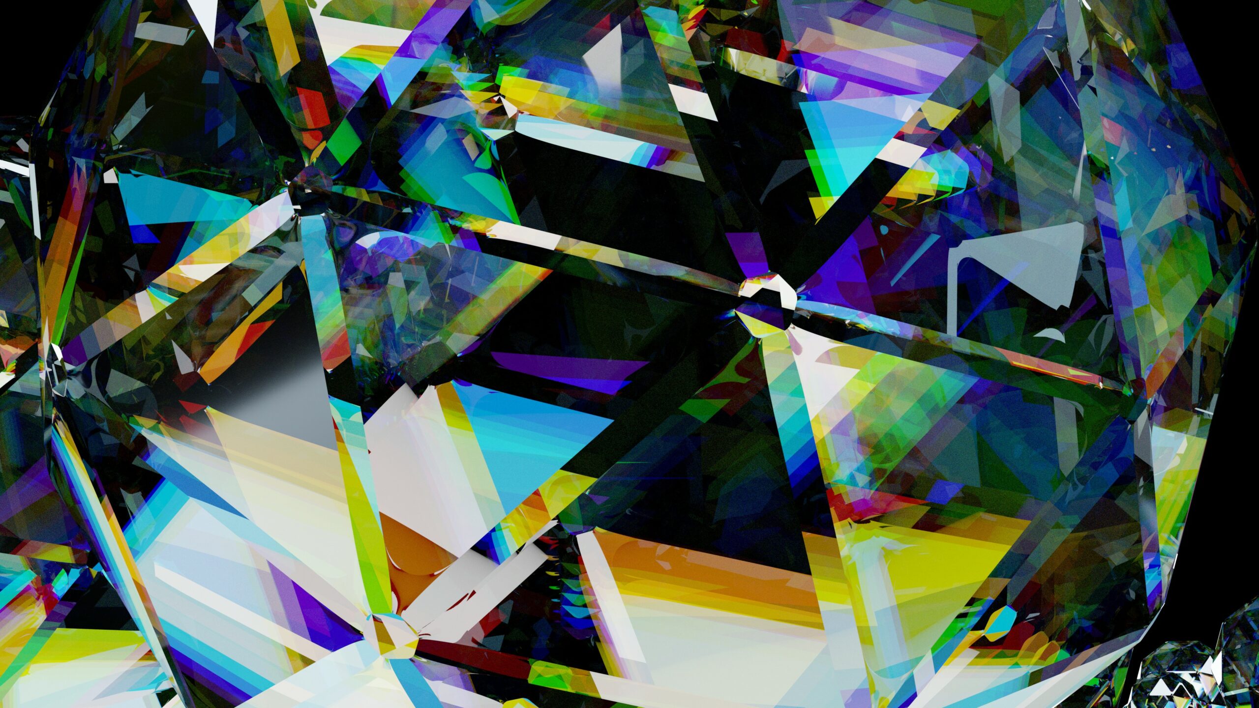
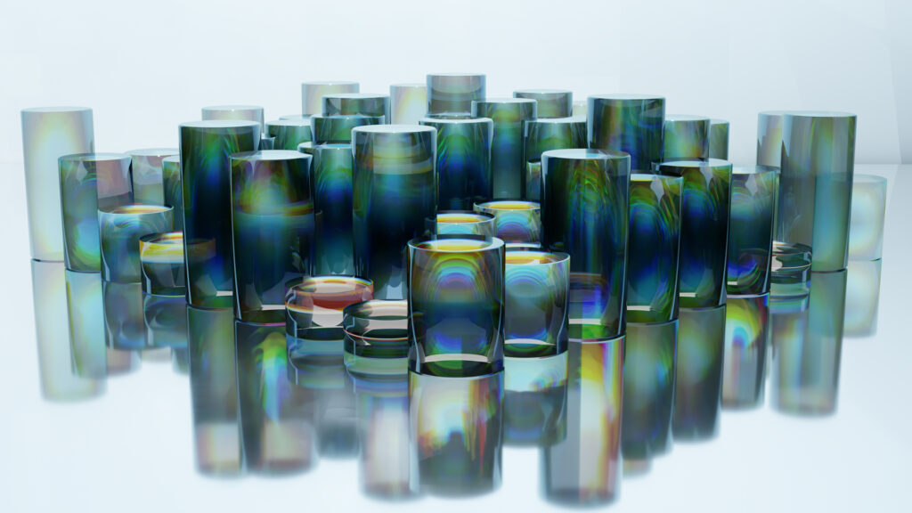
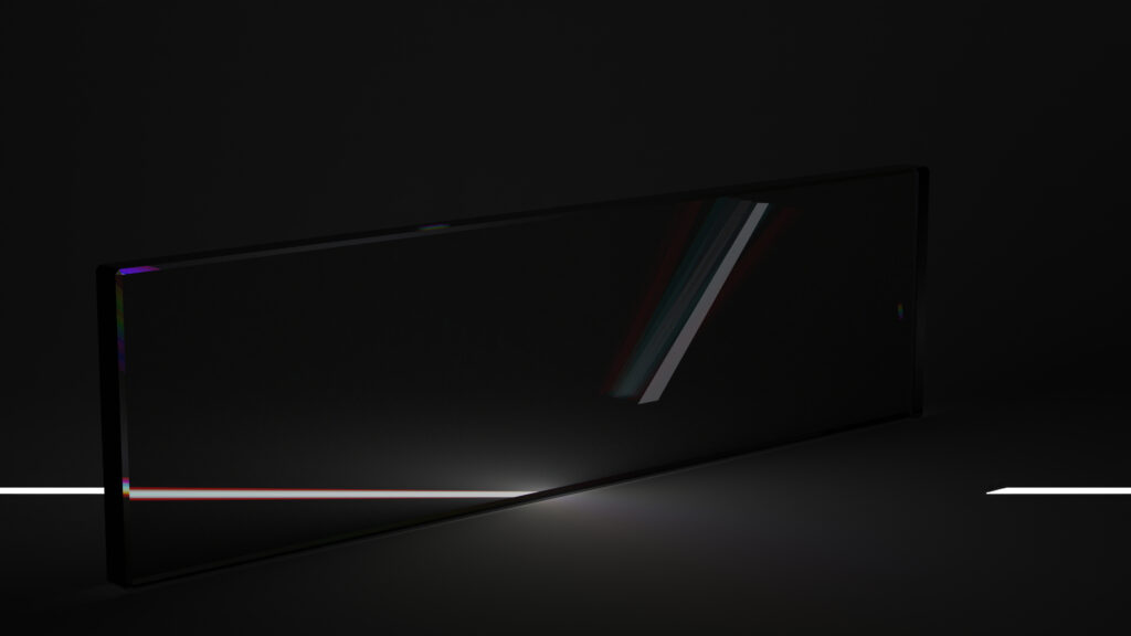
Here are a few more renders of glass. The glass material shows a colour spectrum attempting to mimic a prism. Unfortunately there is a quirk.
For each of the rainbow colours that we normally associate with a prism colour dispersion (red, orange, yellow, green, cyane, blue, and violet), I had to use a separate IOR (Index of Refraction). The problem is that a natural colour spectrum is continuous, rather than made of a set of seven colours, so it looks a bit different to what would normally be expected. The resulting effect is a bit hyperreal, but still fun.
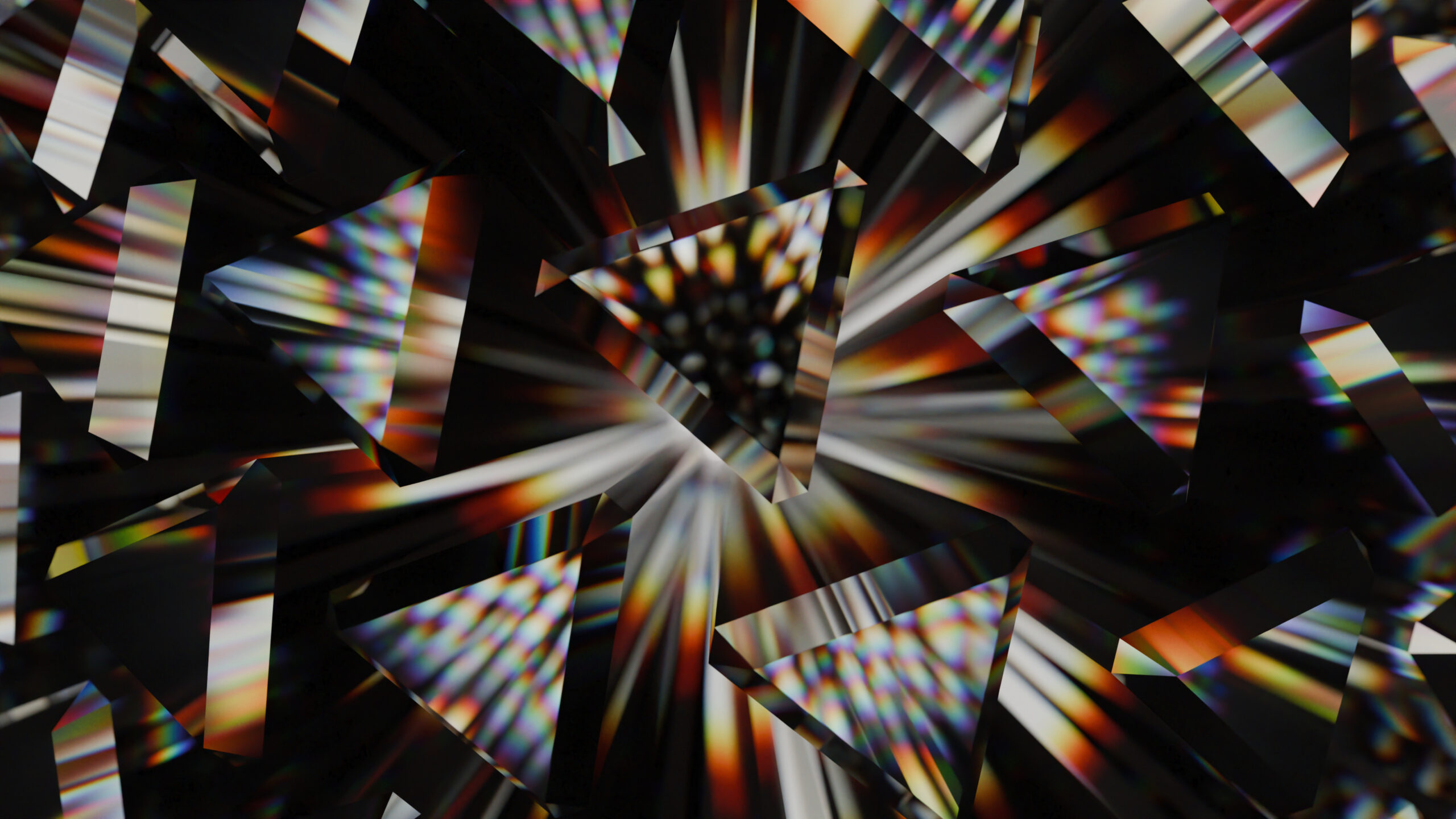
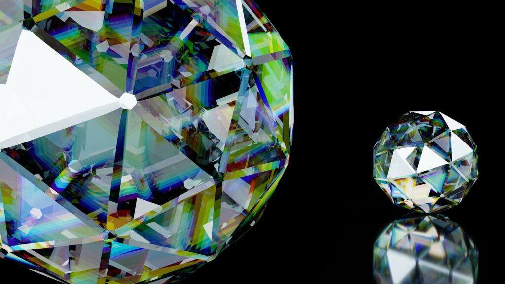
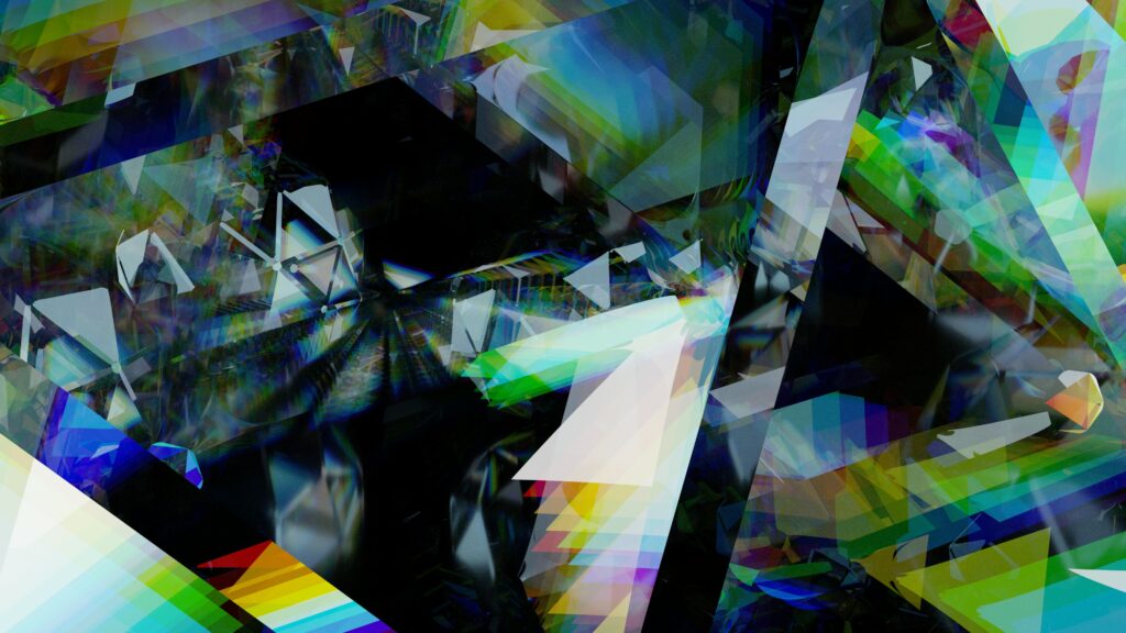
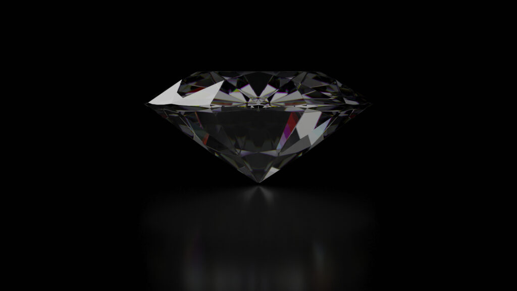
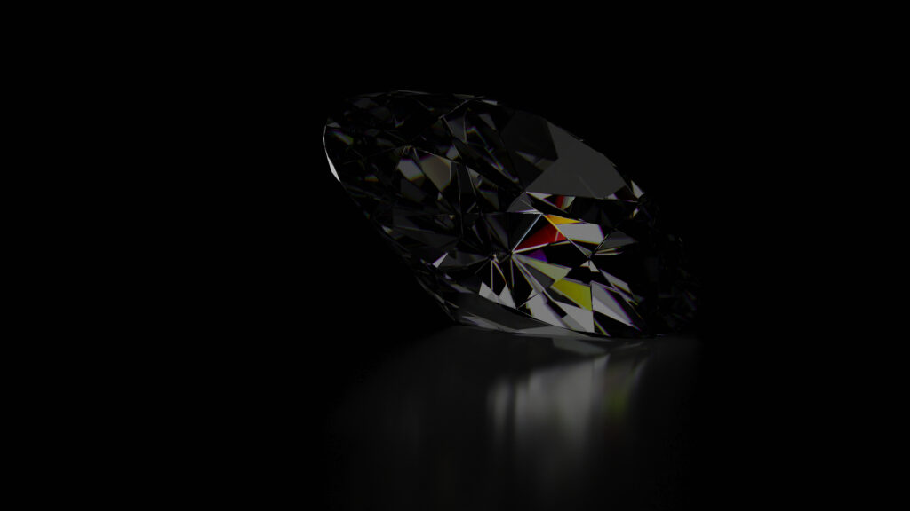
I had a go at printing Prism 2024, and I’m happy with the results.
The image was rendered as A1 300dpi (9933 × 7016 pixels, 69.689928 Megapixel).
It was printed as Print+Frame Deluxe (Canvas textured interchangeable print with frame) via posterfactory.com.au .
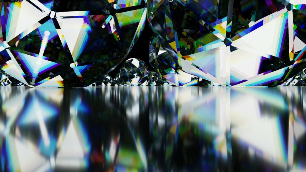
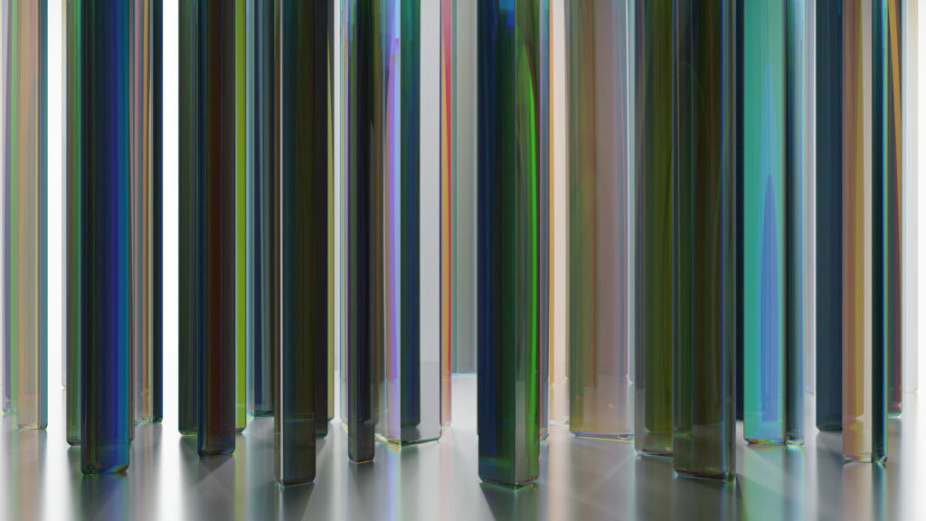
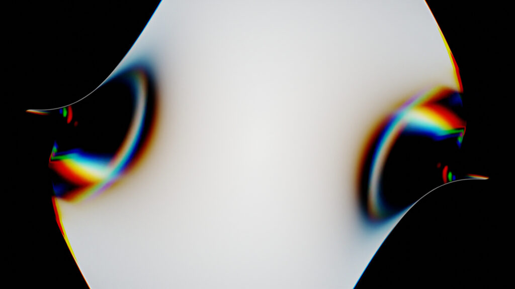
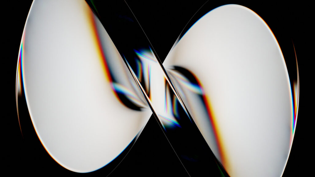
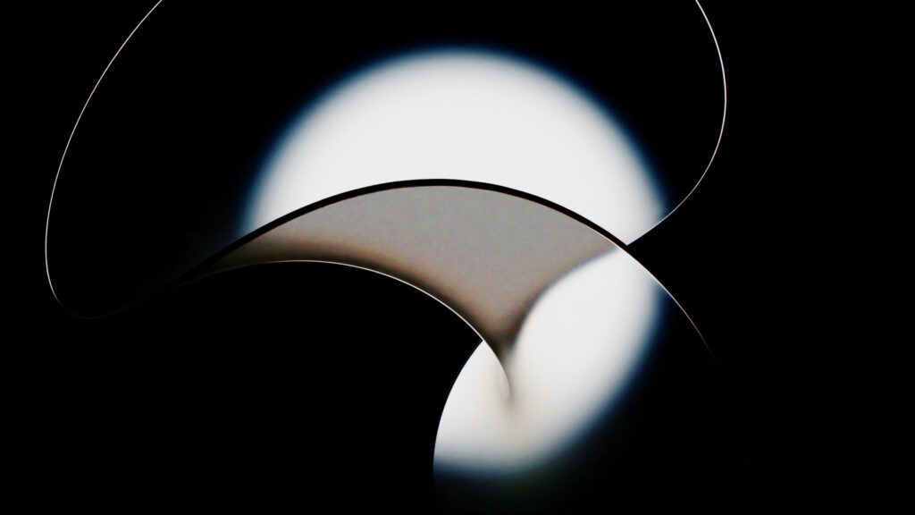
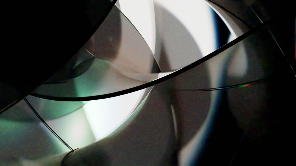
I had another go at glass and caustics. In my mind I imaged that Blender Cycles can do a glass prism effect without any special workarounds, with the current version of 2.8. Wrong. On the upside, I walked away with some fun renders.

Edit 2024.01.15
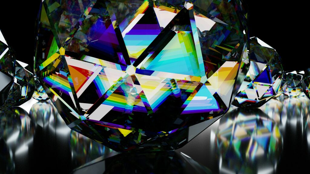
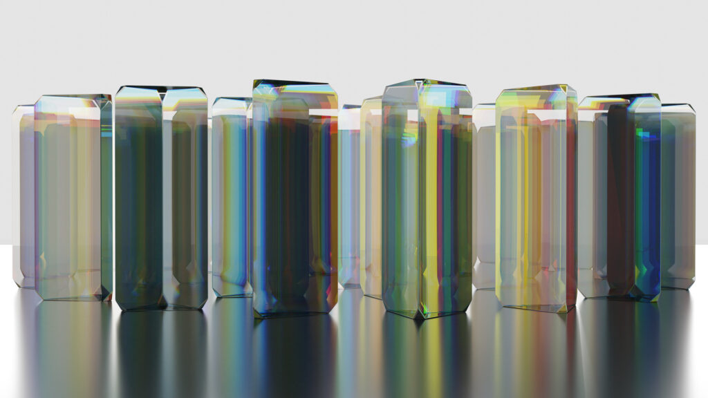
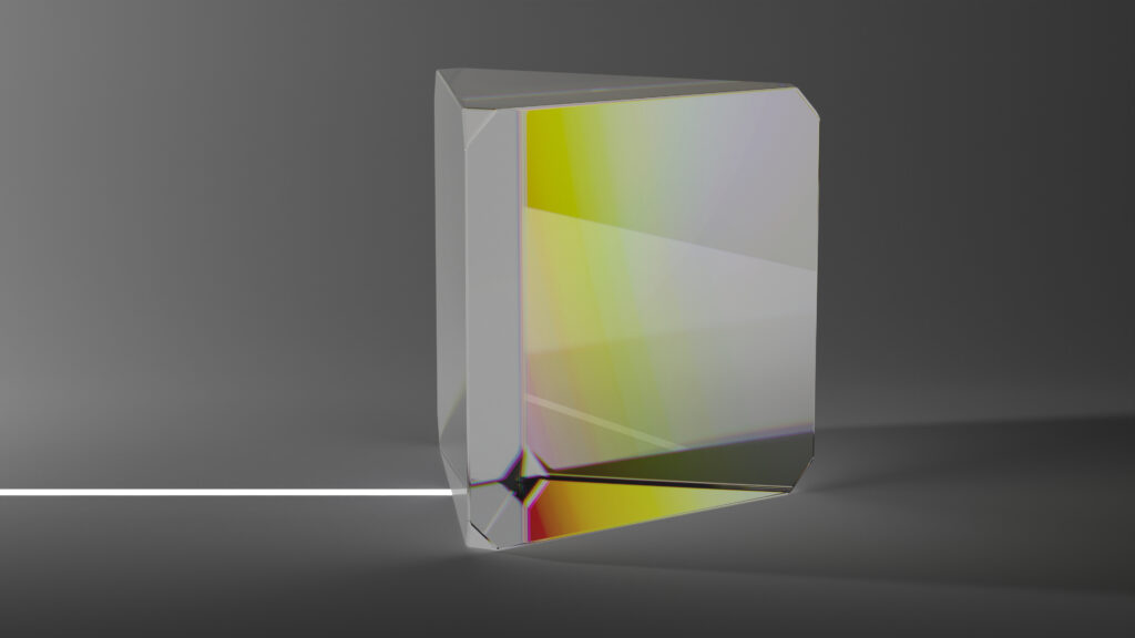
Later I had another go, with simple prim shapes and more colour components. It still looks like a mixed bag as far as real-ish-ness. The big workaround was mixing six glass materials, each with a different colour and refractive index, into one.
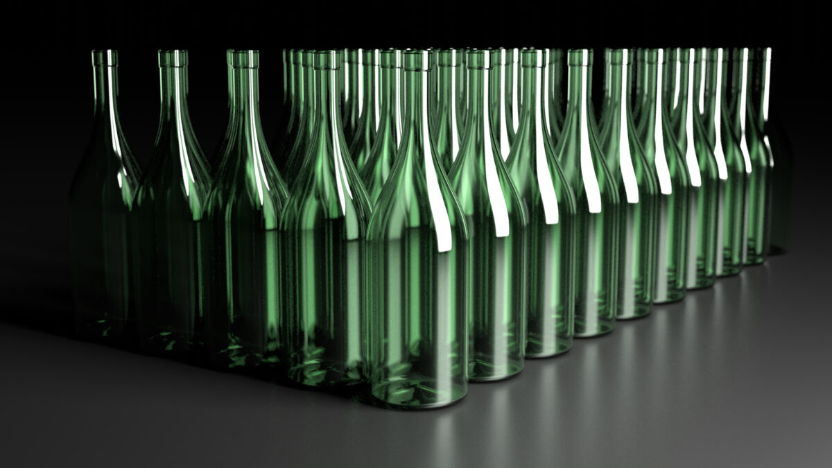
Fast moving consumer goods such as beverages are commonly packaged in bottles. Showing a bottle that represents a product is fundamental to promoting and selling such products. There’s no mystery there. But where do those perfect and stylised images come from?
(more…)